Galaxy Note 7 System Wallpapers

Galaxy Note 7 System Wallpapers

Visual Systems

I created a system wallpaper family for the Galaxy Note 7's four product colors. The work connects layered light, spatial depth, and restrained motion to the product's industrial design and global visual marketing.

Duration

2016

Company

Samsung

Role

Visual Designer

Scope of work

Wallpaper art direction, motion concept, color development, device adaptation, marketing assets

Visual Systems

I created a system wallpaper family for the Galaxy Note 7's four product colors. The work connects layered light, spatial depth, and restrained motion to the product's industrial design and global visual marketing.

Duration

2016

Company

Samsung

Role

Visual Designer

Scope of work

Wallpaper art direction, motion concept, color development, device adaptation, marketing assets

Overview

Overview

From the surface of the device to the screen, I connected the distinct character of four colorways into one cohesive family.

The Galaxy Note 7 launched in black, silver, gold, and blue. I developed a coordinated wallpaper system for those finishes and extended the visual language into global product marketing.

Four Galaxy Note 7 colorways paired with coordinated abstract wallpapers.

Overview

Overview

From the surface of the device to the screen, I connected the distinct character of four colorways into one cohesive family.

The Galaxy Note 7 launched in black, silver, gold, and blue. I developed a coordinated wallpaper system for those finishes and extended the visual language into global product marketing.

Origin

Origin

Every color on screen began with a single painting. The tonal variation and negative space held within hanji became light and depth in a digital space.

At university, I dyed and layered hanji to explore how color permeates the material and how light changes with the thickness of each layer. The principles of absorption, layering, and negative space I discovered in my 2010 personal work, Overlay, later became the visual foundation for shaping planes and light on a digital screen.

Origin

Origin

Every color on screen began with a single painting. The tonal variation and negative space held within hanji became light and depth in a digital space.

At university, I dyed and layered hanji to explore how color permeates the material and how light changes with the thickness of each layer. The principles of absorption, layering, and negative space I discovered in my 2010 personal work, Overlay, later became the visual foundation for shaping planes and light on a digital screen.

Abstract Galaxy Note 7 wallpaper studies using circular forms, soft light, and layered shadows.

Visual Principles

Visual Principles

I distilled the way color permeates, planes overlap, and light rests in negative space into three visual principles.

Absorption became depth through color, layering became an order of planes, and negative space became room for light to spread. These principles formed a shared framework across every wallpaper, preserving a consistent sense of space and emotion across colorways.

Layered circular wallpaper compositions exploring scale, overlap, light, and shadow.

Visual Principles

Visual Principles

I distilled the way color permeates, planes overlap, and light rests in negative space into three visual principles.

Absorption became depth through color, layering became an order of planes, and negative space became room for light to spread. These principles formed a shared framework across every wallpaper, preserving a consistent sense of space and emotion across colorways.

Interaction

Interaction

I designed a wallpaper where light and color move with every tilt of the device.

When the device’s gyroscope detects a tilt of up to ±20° around the X-axis, color, light, and shadow shift with the angle. Each movement reveals a subtly different surface within the same wallpaper.

Galaxy Note 7 wallpaper depth layers and tilt-responsive motion states.

Interaction

Interaction

I designed a wallpaper where light and color move with every tilt of the device.

When the device’s gyroscope detects a tilt of up to ±20° around the X-axis, color, light, and shadow shift with the angle. Each movement reveals a subtly different surface within the same wallpaper.

Colorway

Colorway

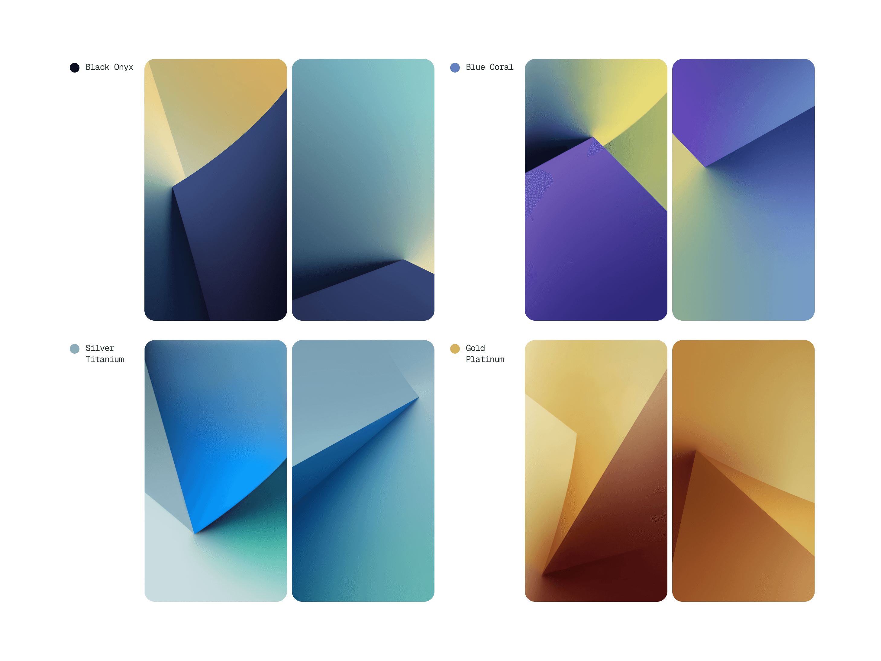
One visual language, two distinct roles. The lock screen brings the composition forward; the home screen recedes, adapting visual density to how each screen is used.

Drawing from the product’s CMF—color, material, and finish—I developed each colorway to align the hardware and on-screen impression. The lock and home screens form one continuous experience: with less information to accommodate, the lock screen foregrounds the composition, while the home screen quiets the background for apps and icons.
Colorway

Colorway

One visual language, two distinct roles. The lock screen brings the composition forward; the home screen recedes, adapting visual density to how each screen is used.

Drawing from the product’s CMF—color, material, and finish—I developed each colorway to align the hardware and on-screen impression. The lock and home screens form one continuous experience: with less information to accommodate, the lock screen foregrounds the composition, while the home screen quiets the background for apps and icons.

Galaxy Note 7 wallpaper palettes aligned with black, silver, gold, and blue hardware finishes.

Responsive

Responsive

To ensure one image holds together on every screen, I designed around a square safe zone that preserves the core composition in both portrait and landscape.

Galaxy Note7 supported both portrait and landscape orientations across multiple resolutions. I placed the primary forms within a square safe area so the composition would remain balanced as the wallpaper rotated or cropped across different orientations and aspect ratios.

Global Galaxy Note 7 marketing applications featuring the system wallpaper artwork.

Responsive

Responsive

To ensure one image holds together on every screen, I designed around a square safe zone that preserves the core composition in both portrait and landscape.

Galaxy Note7 supported both portrait and landscape orientations across multiple resolutions. I placed the primary forms within a square safe area so the composition would remain balanced as the wallpaper rotated or cropped across different orientations and aspect ratios.

Marketing

Marketing

The wallpapers moved beyond the default screen to shape the color and atmosphere of Galaxy Note7’s global launch.

The finished wallpapers shipped as the device’s default screens and extended into global product imagery, marketing visuals, and Samsung Design’s Galaxy Note7 design story. By carrying the same visual mood across the screen, the hardware, and the campaign, they helped present the product as one cohesive experience.

Marketing

Marketing

The wallpapers moved beyond the default screen to shape the color and atmosphere of Galaxy Note7’s global launch.

The finished wallpapers shipped as the device’s default screens and extended into global product imagery, marketing visuals, and Samsung Design’s Galaxy Note7 design story. By carrying the same visual mood across the screen, the hardware, and the campaign, they helped present the product as one cohesive experience.